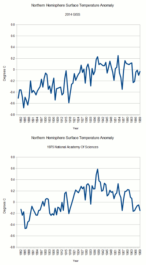
As of 1975, the world’s top scientists saw no warming from 1900 through 1970. The National Academy of Sciences generated the below graph below in 1975.
From: Tom Wigley
To: Phil Jones
Subject: 1940s
Date: Sun, 27 Sep 2009 23:25:38 -0600
Cc: Ben Santer
It would be good to remove at least part of the 1940s blip, but we are still left with “why the blip”.So they did just that. They removed the 1940s blip, as well as all that unpleasant post-1940’s cooling. The animation below shows how the data has been changed since 1975. At the time, there wasn’t any question about global cooling, so our friends at NASA and NCDC simply rewrote history ....Read The Rest Of The Story Of Orwellian Leftist Data Manipulation HERE


No comments:
Post a Comment